Back

Back

Fondazione De Rigo
Website

Building Trust Through Storytelling

Fondazione De Rigo
Website

Building Trust Through Storytelling

Fondazione De Rigo
Website

Building Trust Through Storytelling

Year

2026

Role

UX/UI Designer

Team

2 Designers 1 Developer 1 Project Manager

Skills

UX/UI Design Information Architecture Content Strategy Design Handoff Accessibility

Fondazione De Rigo homepage displayed on a laptop, featuring two students and calls to donate through 5×1000 or submit a project.

Year

2026

Role

UX/UI Designer

Team

2 Designers 1 Developer 1 Project Manager

Skills

UX/UI Design Information Architecture Content Strategy Design Handoff Accessibility

The Challenge

After we-go redesigned De Rigo’s main website, the Fondazione needed a clearer and more credible digital presence. The old site lacked structure, hierarchy, and strong storytelling, making it harder to understand its mission, explore its projects, and know how to contribute or submit a project.

The Solution

We redesigned the website around a trust-building narrative that guides visitors from the Fondazione’s mission, history, and projects to clear ways to donate or submit a project. Simplified content, stronger navigation, flexible project structures, and progressive disclosure made complex information easier to understand, while a careful use of imagery and varied layouts kept the experience clear, engaging, and consistent with the wider De Rigo brand.

Fondazione De Rigo website screens highlighting its mission, projects, donation options, and project applications.
The Process

Building the story before the pages

With a short timeline, we kept the research focused and worked closely with the client to define the content the website needed. We reviewed the available material, explored different experience directions, and used client feedback to align on the strongest one. From there, we refined the content requirements, identified gaps, and shaped the material into a clearer narrative for the site. The Project Manager supported alignment by coordinating timelines and consolidating feedback.

First iteration of Fondazione De Rigo homepage hero with mission statement, donation call to action, and project submission button.

With a short timeline, we kept the research focused and worked closely with the client to define the content the website needed. We reviewed the available material, explored different experience directions, and used client feedback to align on the strongest one. From there, we refined the content requirements, identified gaps, and shaped the material into a clearer narrative for the site. The Project Manager supported alignment by coordinating timelines and consolidating feedback.

First iteration of Fondazione De Rigo homepage hero with mission statement, donation call to action, and project submission button.

Designing around uneven content

The design phase focused on turning limited and uneven content into a clear, coherent, and story-led experience across the entire website. We reserved original imagery for key moments, introduced carefully selected stock photography where needed, and relied on layout, typography, and varied compositions to avoid repetition. Across institutional, project, donation, and submission pages, we used progressive disclosure to keep dense information approachable, with accordions organizing FAQs, regulatory details, financial reporting, and donation guidance. For projects, two distinct card systems made the difference between detailed, interactive initiatives and lighter “Other Projects” immediately clear. The final design received positive feedback from both users and the client, supporting its effectiveness in meeting the project’s goals.

Fondazione De Rigo visual system showing donation prompts, project cards, family imagery, and branded graphic elements.

The design phase focused on turning limited and uneven content into a clear, coherent, and story-led experience across the entire website. We reserved original imagery for key moments, introduced carefully selected stock photography where needed, and relied on layout, typography, and varied compositions to avoid repetition. Across institutional, project, donation, and submission pages, we used progressive disclosure to keep dense information approachable, with accordions organizing FAQs, regulatory details, financial reporting, and donation guidance. For projects, two distinct card systems made the difference between detailed, interactive initiatives and lighter “Other Projects” immediately clear. The final design received positive feedback from both users and the client, supporting its effectiveness in meeting the project’s goals.

Fondazione De Rigo visual system showing donation prompts, project cards, family imagery, and branded graphic elements.

Preparing the design for development

I structured and documented the Figma file with reusable components, content rules, interactions, and annotations to support a smooth handoff. The developer used Claude Code and the Figma MCP connection to read the design structure and generate the front end, then coded the animations separately before the website was launched.

Responsive Fondazione De Rigo homepage on desktop and mobile.

I structured and documented the Figma file with reusable components, content rules, interactions, and annotations to support a smooth handoff. The developer used Claude Code and the Figma MCP connection to read the design structure and generate the front end, then coded the animations separately before the website was launched.

Responsive Fondazione De Rigo homepage on desktop and mobile.

Before asking people to contribute, we first had to help them understand and trust Fondazione De Rigo.

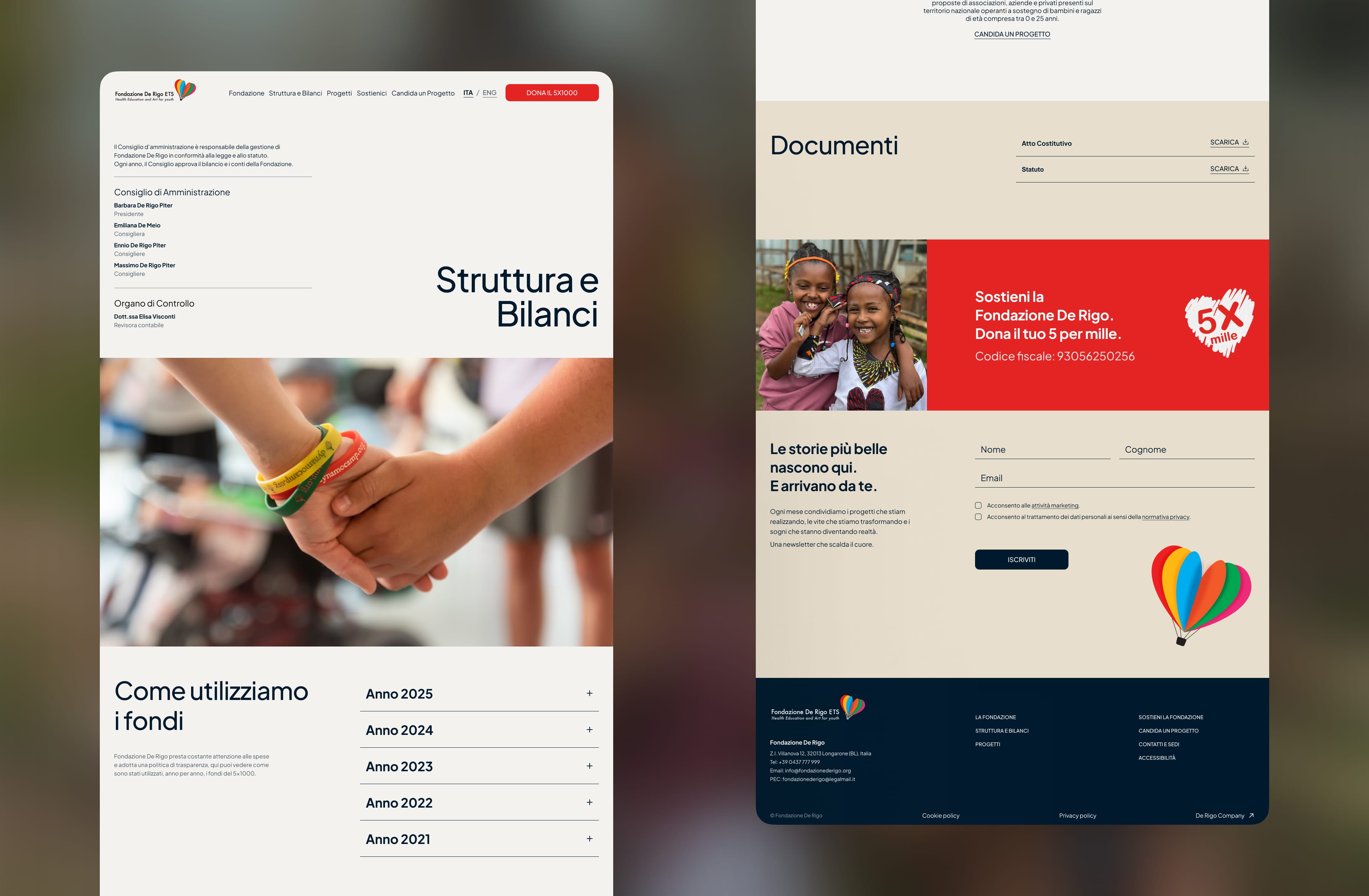
Fondazione De Rigo interface sections for fund transparency, documents, FAQs, and supported projects.

Wrapping up

I enjoyed the challenge of working within a short timeline and turning limited content into a clear, trustworthy experience. The uneven amount of information across projects required careful trade-offs in how each one was presented, while the visual direction had to connect Fondazione De Rigo to the wider De Rigo brand without losing its own identity. It also showed me the value of shaping content, storytelling, and design together to make complex information easier to understand and build trust through a more credible experience. Following the work through handoff helped ensure the design decisions were clearly documented and carried into development.

Credits

Thanks to the Design Lead for shaping and validating the direction, the Web Experience Team Lead for her feedback and support, the Project Manager for keeping the project aligned, the developer for bringing the experience to life, and everyone involved for their feedback and contribution.

Claudia Tasca

Web Experience Team Leader

Valeria Sciacca

Design Lead

Nicola Pedrocco

Web Developer

Jessica Miola

Project Manager

Thanks to the Design Lead for shaping and validating the direction, the Web Experience Team Lead for her feedback and support, the Project Manager for keeping the project aligned, the developer for bringing the experience to life, and everyone involved for their feedback and contribution.

Claudia Tasca

Web Experience Team Leader

Valeria Sciacca

Design Lead

Nicola Pedrocco

Web Developer

Jessica Miola

Project Manager

Fondazione De Rigo support and newsletter pages featuring donation messaging, project submissions, and beneficiary stories.
Fondazione De Rigo project application page showing the submission process, FAQs, and online form.
Fondazione De Rigo governance and transparency pages with leadership details, fund reports, documents, and newsletter signup.
Animated screen recording of Claude extracting node structure and design data from a Figma file via MCP.

Hey There

Curious about me?

Get a closer look at my journey, experience, and what drives my work.

Hey There

Curious about me?

Get a closer look at my journey, experience, and what drives my work.

Hey There

Curious about me?

Get a closer look at my journey, experience, and what drives my work.