Back

Back

TBS
Website

Designing Beyond The Stand

TBS
Website

Designing Beyond The Stand

TBS
Website

Designing Beyond The Stand

Year

2026

Role

UX/UI Designer

Team

3 Designers 1 Developer 1 Project Manager

Skills

UX/UI Design Information Architecture Interaction Design Prototyping Framer Development Accessibility Design Handoff

TBS website homepage displayed on a laptop, featuring an exhibition hall and the message ‘To be Smart. To be Solutions.

Year

2026

Role

UX/UI Designer

Team

3 Designers 1 Developer 1 Project Manager

Skills

UX/UI Design Information Architecture Interaction Design Prototyping Framer Development Accessibility Design Handoff

The Challenge

TBS partnered with we-go for a complete rebrand and website redesign. The existing experience lacked clear information hierarchy, intuitive navigation, and a cohesive story to communicate TBS’s expertise. With a short timeline and limited budget, we also needed a solution that could keep development effort lean while still giving the new identity a strong digital presence.

The Solution

We translated the new identity into a story-led, accessible experience with clearer navigation, stronger information hierarchy, and a visual language built around TBS’s work and method. We used Framer to keep production lean and flexible, then adapted the experience to WordPress while preserving the core design direction through launch.

TBS website collage showing the homepage prototype, Projects page and Method page.
The Process

A new brand needed a new home
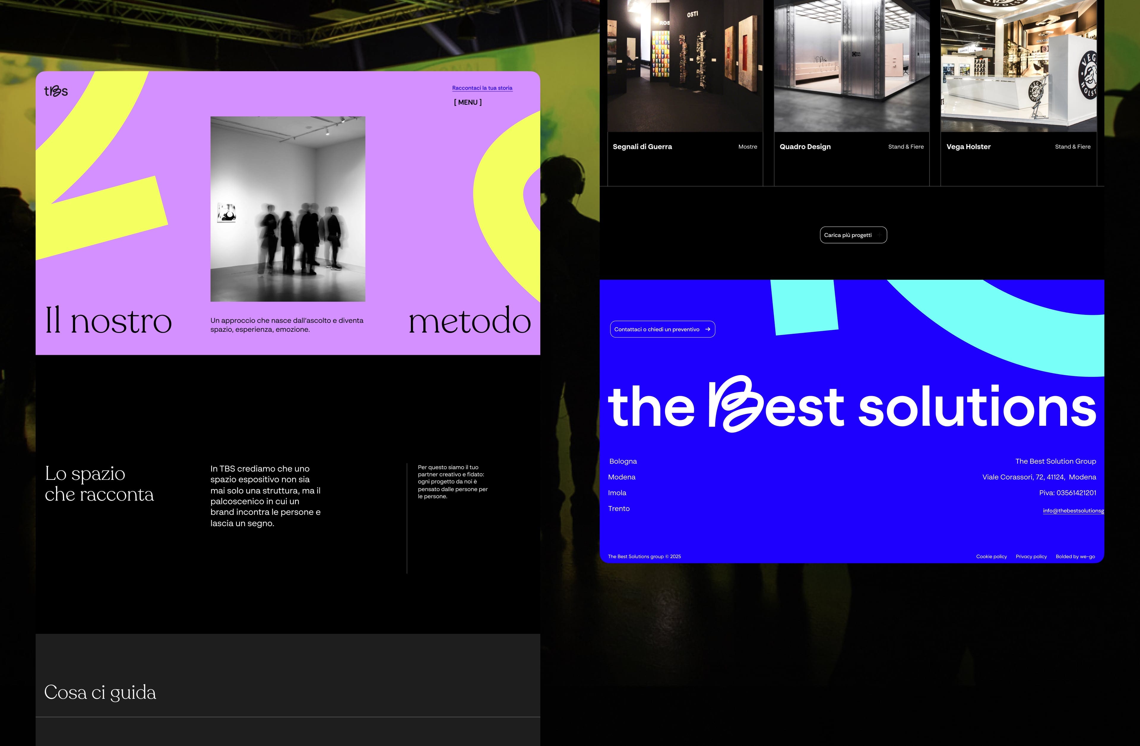
The Branding team created a new identity for TBS, and our job was to bring it into the website. Initial domain and competitor research, along with a first homepage direction, gave us a starting point. The project was initially planned around an existing WordPress theme, which set the first technical boundaries for the experience. As the design evolved, we also started exploring whether a different production approach could better fit the project’s timeline, budget, and ambition.

TBS website legacy screens showing the brand method, project gallery, and footer.

The Branding team created a new identity for TBS, and our job was to bring it into the website. Initial domain and competitor research, along with a first homepage direction, gave us a starting point. The project was initially planned around an existing WordPress theme, which set the first technical boundaries for the experience. As the design evolved, we also started exploring whether a different production approach could better fit the project’s timeline, budget, and ambition.

TBS website legacy screens showing the brand method, project gallery, and footer.

Turning the website into a story

We rebuilt the experience around a simple idea: show what TBS does, how they work, and why their approach matters. We simplified the navigation and used the homepage to guide visitors toward the key paths: exploring TBS’s method, browsing projects, or starting a new conversation. The Method page brought together process, values, team, and approach, while the portfolio stayed deliberately lean so the work could speak through imagery.

Interactions and motion became part of that storytelling, helping us give the new identity a stronger digital expression. At the same time, we treated accessibility as a core design principle, using clear hierarchy, readable content, and understandable interaction patterns to keep the experience easy to navigate.

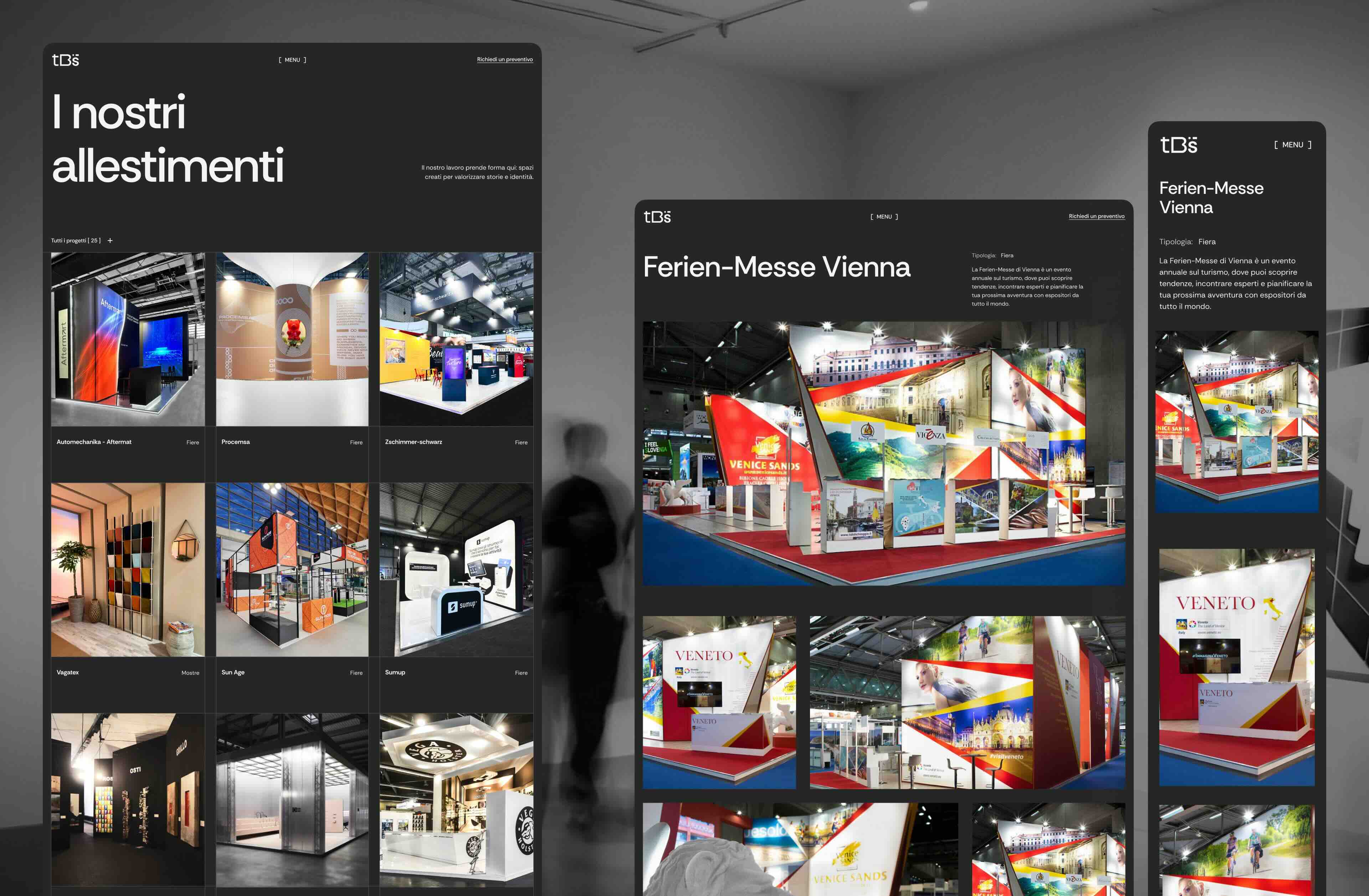
TBS homepage and project index screens featuring exhibition stands and brand storytelling.

We rebuilt the experience around a simple idea: show what TBS does, how they work, and why their approach matters. We simplified the navigation and used the homepage to guide visitors toward the key paths: exploring TBS’s method, browsing projects, or starting a new conversation. The Method page brought together process, values, team, and approach, while the portfolio stayed deliberately lean so the work could speak through imagery.

Interactions and motion became part of that storytelling, helping us give the new identity a stronger digital expression. At the same time, we treated accessibility as a core design principle, using clear hierarchy, readable content, and understandable interaction patterns to keep the experience easy to navigate.

TBS homepage and project index screens featuring exhibition stands and brand storytelling.

Making the design real with Framer

As the design evolved, we explored Framer as a leaner path from design to production. It brought design, CMS, localization, hosting, and development into one environment, helping us reduce developer time while giving us more freedom to turn the prototype into production-ready motion and reusable components.

We built a working demo of the full website and presented both Framer and WordPress to the client, outlining the strengths and limitations of each. This gave us a real basis for comparing speed, flexibility, maintenance, and long-term fit.

TBS website shown in Framer across desktop, tablet, and mobile breakpoints.

As the design evolved, we explored Framer as a leaner path from design to production. It brought design, CMS, localization, hosting, and development into one environment, helping us reduce developer time while giving us more freedom to turn the prototype into production-ready motion and reusable components.

We built a working demo of the full website and presented both Framer and WordPress to the client, outlining the strengths and limitations of each. This gave us a real basis for comparing speed, flexibility, maintenance, and long-term fit.

TBS website shown in Framer across desktop, tablet, and mobile breakpoints.

Adapting without losing the design

The client ultimately chose WordPress as the more established fit for their needs. The Framer demo still gave us a validated experience and a clear benchmark for how the final website should feel.

Moving back to the chosen theme meant adapting some interactions and components, while rebuilding custom elements where they mattered most. During development, we worked to preserve as much fidelity to the original design as possible, assessing trade-offs whenever technical constraints required a different solution. We also handled QA and content entry through launch.

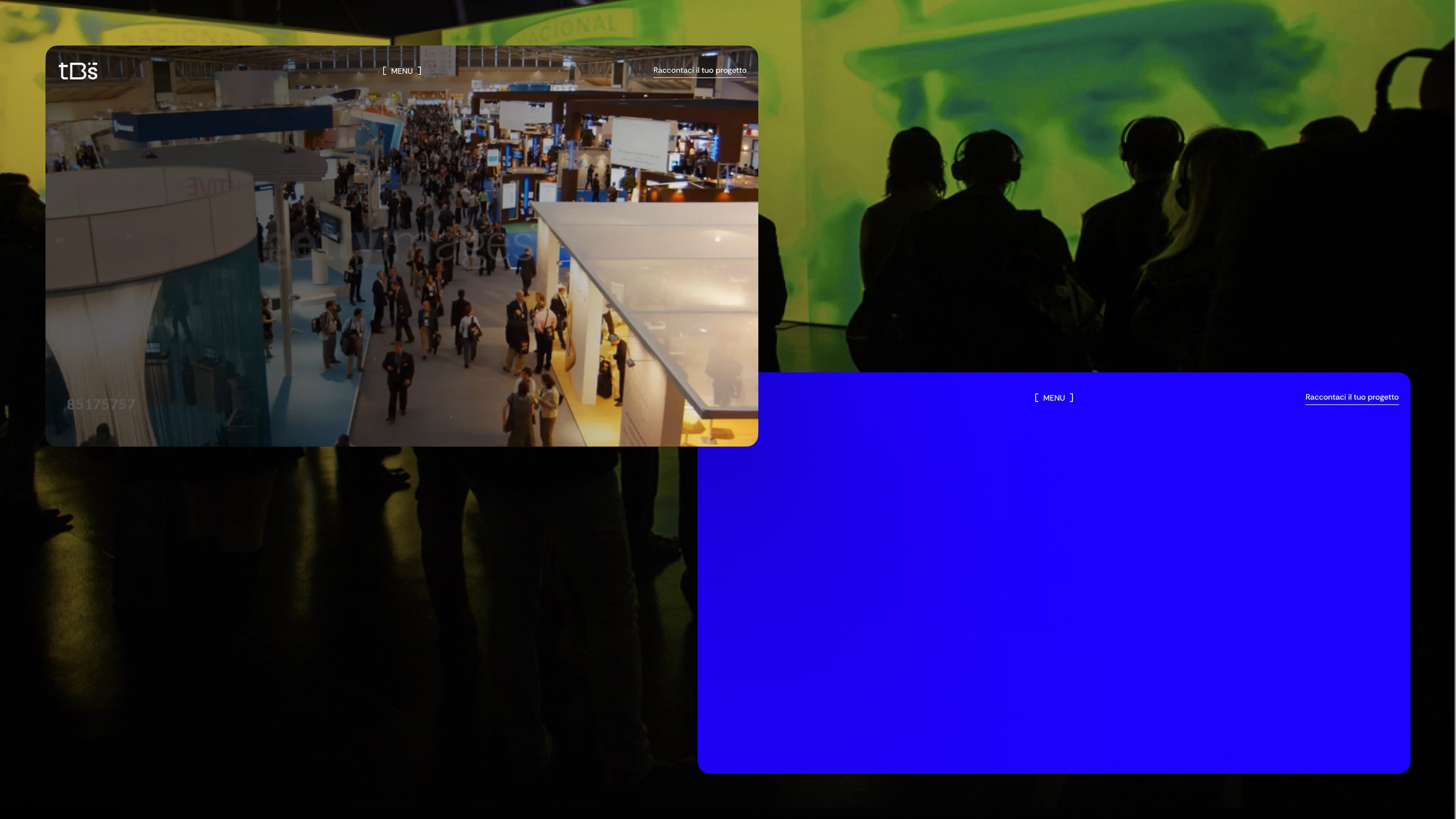
TBS homepage hero featuring an exhibition hall and the message ‘To be Smart. To be Solutions.’

The client ultimately chose WordPress as the more established fit for their needs. The Framer demo still gave us a validated experience and a clear benchmark for how the final website should feel.

Moving back to the chosen theme meant adapting some interactions and components, while rebuilding custom elements where they mattered most. During development, we worked to preserve as much fidelity to the original design as possible, assessing trade-offs whenever technical constraints required a different solution. We also handled QA and content entry through launch.

TBS homepage hero featuring an exhibition hall and the message ‘To be Smart. To be Solutions.’

The platform changed. The design intent didnt.

TBS website concepts prototype in Framer of Home and Method pages.

Wrapping up

This project taught me to look beyond the expected production path and explore alternatives when the constraints call for it. Building the Framer version showed me how bringing design closer to production can make decisions more tangible, while the move back to WordPress reinforced the importance of adapting without losing the core design intent. Most importantly, it strengthened how I approach technical constraints and trade-offs as part of the design process itself.

Credits

A big thank you to the Branding team for creating the identity that set the foundation for the project, and to everyone in the Web Experience team who brought it into the digital experience.

Claudia Tasca

Web Experience Team Leader

Valeria Sciacca

Design Lead

Victoria Sartori

UX/UI Designer

Andrea Faggin

Web Developer

Gaetano Corvino

Art Director

Matteo Milan

Graphic Designer

Chiara Vazzola

Project Manager

A big thank you to the Branding team for creating the identity that set the foundation for the project, and to everyone in the Web Experience team who brought it into the digital experience.

Claudia Tasca

Web Experience Team Leader

Valeria Sciacca

Design Lead

Victoria Sartori

UX/UI Designer

Andrea Faggin

Web Developer

Gaetano Corvino

Art Director

Matteo Milan

Graphic Designer

Chiara Vazzola

Project Manager

TBS homepage paired with the quote request form.
TBS method page featuring exhibition visitors and the section ‘Lo spazio che racconta.
Responsive TBS project archive and project detail pages showing exhibition stand photography.
TBS design system showing buttons, form fields, brand elements, project cards, and footer components.

Hey There

Curious about me?

Get a closer look at my journey, experience, and what drives my work.

Hey There

Curious about me?

Get a closer look at my journey, experience, and what drives my work.

Hey There

Curious about me?

Get a closer look at my journey, experience, and what drives my work.