Back

Back

COZYSHOES
E-commerce
Concept

Shopping With Confidence

COZYSHOES
E-commerce
Concept

Shopping With Confidence

COZYSHOES
E-commerce
Concept

Shopping With Confidence

Year

2025

Role

Product Designer

Skills

User Research Product Strategy Interaction Design UI Design Prototyping Usability Testing

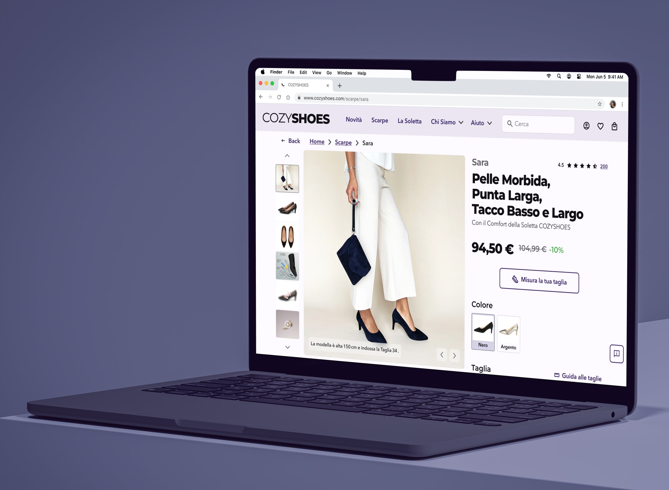
COZYSHOES product page displayed on a laptop, featuring the Sara shoe and size-finding tools.

Year

2025

Role

Product Designer

Skills

User Research Product Strategy Interaction Design UI Design Prototyping Usability Testing

The Challenge

Women with bunions or hyperhidrosis often have to choose between shoes that look elegant and shoes they can comfortably wear for hours. COZYSHOES set out to close that gap with formal footwear designed around pain relief, breathability, and support. The challenge was not only developing a credible alternative, but also communicating its benefits clearly online, where customers could not try the shoes on and needed enough confidence in the fit, comfort, and technology to consider purchasing.

The Solution

I designed a clearer product detail page that helps shoppers evaluate fit, comfort, and product benefits before committing to a purchase. The experience combines detailed imagery, model sizing, inclusive size charts, fit guidance, verified reviews, and two ways to measure the foot, including a guided scan. Rather than replacing familiar e-commerce patterns with a more complex AI showroom, I chose a conventional two-column layout that was easier to understand and more realistic to implement, while still giving users the reassurance they would normally seek in-store.

The Results

6/6

Users Task Completion
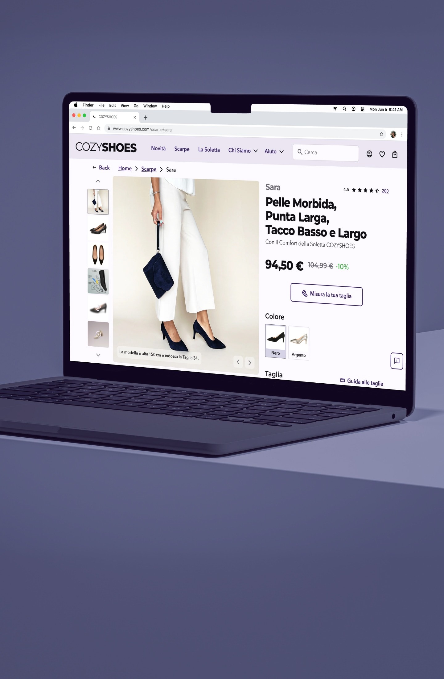
Prototype of COZYSHOES product detail page for the Sara shoe, with product gallery, price, color options, and size guidance.
The Process

Understanding the problem space

I started by understanding both the problem space and the market. Through desk research, I explored how people manage bunions and hyperhidrosis, how they shop for footwear online, and the factors that influence purchase confidence. I also analyzed 16 direct and indirect competitors, from specialist footwear brands to mainstream e-commerce retailers, identifying common patterns, strengths, and opportunities.

Industry data showed that while 70% of retail traffic comes from mobile, desktop sessions are twice as engaging and convert 85% better (3.7% vs. 2%) in retail*. This suggested that users often discover products on mobile but rely on desktop when they need to compare information and make confident purchasing decisions.

* Industry benchmarks have been updated to the latest available data (2025–2026) to provide current context. The original project research, design decisions, and outcomes remain unchanged. Contentsquare - Digital Experience Benchmarks, Contentsquare - Retail Digital Experience Benchmarks.

Research findings showing high mobile traffic but stronger engagement and conversion on desktop.

I started by understanding both the problem space and the market. Through desk research, I explored how people manage bunions and hyperhidrosis, how they shop for footwear online, and the factors that influence purchase confidence. I also analyzed 16 direct and indirect competitors, from specialist footwear brands to mainstream e-commerce retailers, identifying common patterns, strengths, and opportunities.

Industry data showed that while 70% of retail traffic comes from mobile, desktop sessions are twice as engaging and convert 85% better (3.7% vs. 2%) in retail*. This suggested that users often discover products on mobile but rely on desktop when they need to compare information and make confident purchasing decisions.

* Industry benchmarks have been updated to the latest available data (2025–2026) to provide current context. The original project research, design decisions, and outcomes remain unchanged. Contentsquare - Digital Experience Benchmarks, Contentsquare - Retail Digital Experience Benchmarks.

Research findings showing high mobile traffic but stronger engagement and conversion on desktop.

Talking to users

Research helped me understand the market, but interviews explained the behavior behind it. I interviewed five online shoppers, three of whom had bunions or hyperhidrosis, to learn how they evaluate shoes online and what influences their purchasing decisions.

A consistent pattern emerged. Users struggled with inconsistent sizing across brands, relied heavily on reviews to judge comfort and fit, and still felt more confident trying shoes on in-store. Several also described browsing on mobile before switching to desktop to compare products and make their final decision. I synthesized these findings into a persona to keep design decisions grounded in real user needs throughout the project.

User research quotes alongside a persona summarizing online shoe-shopping goals, behaviors, and pain points.

Research helped me understand the market, but interviews explained the behavior behind it. I interviewed five online shoppers, three of whom had bunions or hyperhidrosis, to learn how they evaluate shoes online and what influences their purchasing decisions.

A consistent pattern emerged. Users struggled with inconsistent sizing across brands, relied heavily on reviews to judge comfort and fit, and still felt more confident trying shoes on in-store. Several also described browsing on mobile before switching to desktop to compare products and make their final decision. I synthesized these findings into a persona to keep design decisions grounded in real user needs throughout the project.

User research quotes alongside a persona summarizing online shoe-shopping goals, behaviors, and pain points.

Turning insights into design goals

Before moving into solutions, I translated the research into a set of clear design priorities. Using an Effort–Impact Matrix, I evaluated opportunities based on both user value and implementation effort, helping distinguish immediate improvements from future ideas.

This process surfaced six key goals: improve size guidance, strengthen fit-specific reviews, expand inclusive sizing, introduce foot measurement, explore virtual fit assistance, and better support cross-device shopping. These priorities became the foundation for the design exploration that followed.

Impact-effort matrix prioritizing fit and sizing improvements for the COZYSHOES experience.

Before moving into solutions, I translated the research into a set of clear design priorities. Using an Effort–Impact Matrix, I evaluated opportunities based on both user value and implementation effort, helping distinguish immediate improvements from future ideas.

This process surfaced six key goals: improve size guidance, strengthen fit-specific reviews, expand inclusive sizing, introduce foot measurement, explore virtual fit assistance, and better support cross-device shopping. These priorities became the foundation for the design exploration that followed.

Impact-effort matrix prioritizing fit and sizing improvements for the COZYSHOES experience.

Exploring different directions

With clear priorities in place, I explored two different concepts through sketching, wireframing, prototyping, and moderated usability testing.

The first solution refined familiar e-commerce patterns by improving size guidance, product imagery, reviews, and fit information. It required less implementation effort and aligned with users' existing mental models. The second reimagined the experience as an AI-powered digital showroom with personalized recommendations and a more immersive interface. While more innovative, it introduced greater complexity, higher development costs, and interactions users were less familiar with.

I chose the first direction because it solved the primary problem, purchase uncertainty, without increasing cognitive load. After iterating on the prototype through moderated usability testing, all six participants successfully completed the core task of finding the right size and adding the product to the cart.

Two early product page concepts exploring different layouts for product and sizing information.

With clear priorities in place, I explored two different concepts through sketching, wireframing, prototyping, and moderated usability testing.

The first solution refined familiar e-commerce patterns by improving size guidance, product imagery, reviews, and fit information. It required less implementation effort and aligned with users' existing mental models. The second reimagined the experience as an AI-powered digital showroom with personalized recommendations and a more immersive interface. While more innovative, it introduced greater complexity, higher development costs, and interactions users were less familiar with.

I chose the first direction because it solved the primary problem, purchase uncertainty, without increasing cognitive load. After iterating on the prototype through moderated usability testing, all six participants successfully completed the core task of finding the right size and adding the product to the cart.

Two early product page concepts exploring different layouts for product and sizing information.

Designing for confidence

The final interface balances elegance with clarity, making it easier for users to evaluate a product before purchasing. A two-column layout keeps the product gallery visible while selecting colors, sizes, and insoles, reducing the need to remember information while navigating the page. Detailed imagery, model sizing, inclusive size charts, verified reviews, and two foot-measurement methods work together to build confidence in choosing the right fit.

Accessibility was considered throughout the interface. I used highly legible typography, an 18 px type scale, descriptive link labels, meaningful alt text, and accessible color contrast to improve readability for all users. One design decision remained intentionally open for future validation: disabling the Add to Cart button until all required options were selected simplified the flow and reduced errors, but introduced a potential accessibility trade-off that would benefit from further testing.

COZYSHOES visual system showing purple and neutral colors, Montserrat and Avenir Next typefaces, and type scale.

The final interface balances elegance with clarity, making it easier for users to evaluate a product before purchasing. A two-column layout keeps the product gallery visible while selecting colors, sizes, and insoles, reducing the need to remember information while navigating the page. Detailed imagery, model sizing, inclusive size charts, verified reviews, and two foot-measurement methods work together to build confidence in choosing the right fit.

Accessibility was considered throughout the interface. I used highly legible typography, an 18 px type scale, descriptive link labels, meaningful alt text, and accessible color contrast to improve readability for all users. One design decision remained intentionally open for future validation: disabling the Add to Cart button until all required options were selected simplified the flow and reduced errors, but introduced a potential accessibility trade-off that would benefit from further testing.

COZYSHOES visual system showing purple and neutral colors, Montserrat and Avenir Next typefaces, and type scale.

The challenge wasn't helping users choose a shoe. It was helping them trust their choice.

Two iterations of the COZYSHOES product detail page shown side by side.

Wrapping up

This project reinforced that reducing uncertainty can be just as valuable as adding new features. Combining desk research, competitor analysis, user interviews, and usability testing challenged my assumptions and helped ground every design decision in evidence. It also deepened my appreciation for accessibility, showing how improvements in clarity, readability, and information hierarchy create better experiences for everyone.

What's next

With more time, I would continue exploring ways to reduce purchase uncertainty while keeping the experience familiar and intuitive.

One direction would be introducing an AI-powered sizing assistant that combines foot measurements with fit preferences, previously owned shoes, and comfort needs to recommend the most suitable size. Another would be experimenting with AR try-on to help users better understand how the shoes look when worn.

I would also validate some interaction decisions through larger usability studies and A/B testing, particularly around form validation and sizing guidance, to measure their impact on confidence and task completion before implementation.

Note: Originally completed in 2025. This case study was updated in 2026 with refreshed writing and current industry benchmarks while preserving the original research, design decisions, and outcomes.

User flow mapping the journey from product selection and sizing to adding a shoe to the cart.
COZYSHOES design system showing icons, grid, form fields, buttons, size selectors, product cards, navigation, and footer.
Product reviews interface with ratings for comfort, quality, size, and fit alongside individual customer reviews.
Size-finding modal offering camera-based foot scanning or a simple manual measurement method.
Shoe size guide comparing EU, UK, US, centimeter, and inch measurements.
Insole information modal explaining comfort features and support options for different foot needs.

Hey There

Curious about me?

Get a closer look at my journey, experience, and what drives my work.

Hey There

Curious about me?

Get a closer look at my journey, experience, and what drives my work.

Hey There

Curious about me?

Get a closer look at my journey, experience, and what drives my work.