Back

Back

I Mille
Fintech
Concept

Giving Teens Financial Freedom

I Mille
Fintech
Concept

Giving Teens Financial Freedom

I Mille
Fintech
Concept

Giving Teens Financial Freedom

Year

2025

Role

Product Designer

Team

3 Designers

Skills

User Research Competitive Analysis Product Strategy Information Architecture Product Design Design Sprint Creative Direction

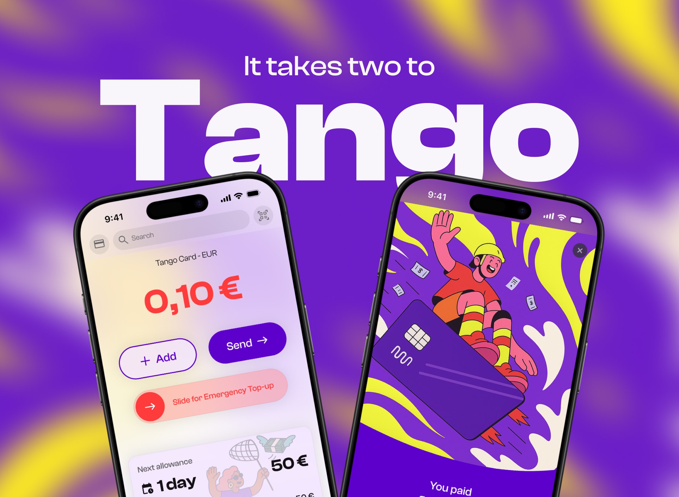
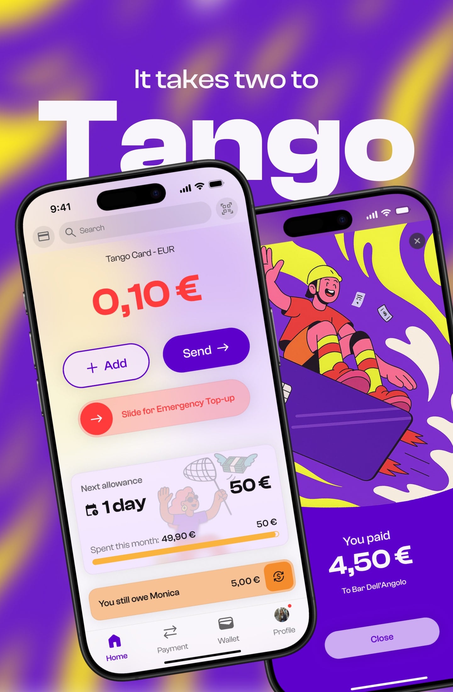
Two iPhones displaying the Tango card app: the home screen and a successful payment screen.

Year

2025

Role

Product Designer

Team

3 Designers

Skills

User Research Competitive Analysis Product Strategy Information Architecture Product Design Design Sprint Creative Direction

The Challenge

Growing up means learning to manage money, but most digital payment tools are still designed for adults. Teens often depend on parents to make payments, transfer funds, or step in when money runs out, limiting their financial independence and creating awkward moments. The challenge was to design an experience that gave teens meaningful autonomy while giving parents enough visibility to feel reassured, without turning support into surveillance.

The Solution

We designed Tango, a mobile payment app for 13 to 17-year-olds paired with a dedicated parent experience. Teens can pay, send money, track their spending, and receive simple budgeting feedback through a playful and secure interface. Parents can set recurring allowances, define an emergency fund, and view spending by category rather than individual purchases. Together, these features are designed to support teen independence and healthier money habits while keeping parents informed without encouraging micromanagement.

Three Tango app screens: home balance, splash screen, and an emergency top-up request with parental visibility notice.
The Process

From brief to prototype

Created as part of a three-week I MILLE Design Challenge, our team used the Design Sprint framework to design a new digital payment experience from an open brief. After exploring different opportunities, we chose to focus on teenagers, an audience increasingly comfortable with digital payments but still underserved by existing financial products. Together, we moved from research to a high-fidelity prototype within a tight timeline, with me contributing across the entire design process.

Three-week project timeline: research and insights, ideation and design, and final touches.

Created as part of a three-week I MILLE Design Challenge, our team used the Design Sprint framework to design a new digital payment experience from an open brief. After exploring different opportunities, we chose to focus on teenagers, an audience increasingly comfortable with digital payments but still underserved by existing financial products. Together, we moved from research to a high-fidelity prototype within a tight timeline, with me contributing across the entire design process.

Three-week project timeline: research and insights, ideation and design, and final touches.

Understanding the opportunity

We combined domain research, competitor analysis, and interviews with three teenagers and their parents to understand how both groups approached money. We found that teens were digitally confident but selective, expecting simple, low-effort tools that gave them greater independence without adding complexity. Parents, on the other hand, wanted to encourage financial responsibility while staying informed without micromanaging. We also identified QR code payments as the best interaction model, offering a familiar cross-platform experience while avoiding the limitations of Apple's NFC restrictions. Together, these insights shaped both the product strategy and the core interaction model.

Three research methods: domain research on contactless payments, competitor benchmarking, and user interviews with teens and parents.

We combined domain research, competitor analysis, and interviews with three teenagers and their parents to understand how both groups approached money. We found that teens were digitally confident but selective, expecting simple, low-effort tools that gave them greater independence without adding complexity. Parents, on the other hand, wanted to encourage financial responsibility while staying informed without micromanaging. We also identified QR code payments as the best interaction model, offering a familiar cross-platform experience while avoiding the limitations of Apple's NFC restrictions. Together, these insights shaped both the product strategy and the core interaction model.

Three research methods: domain research on contactless payments, competitor benchmarking, and user interviews with teens and parents.

Turning research into direction

We translated the research into a primary persona and mapped the core payment journey to define where the experience needed to feel fastest, clearest, and most reassuring. From there, we set four design goals: make payments effortless, support independence without adding complexity, keep parents informed without enabling micromanagement, and build trust through security and clear feedback. These goals guided feature prioritisation and shaped the flow from QR payment to spending visibility and parental oversight.

Persona card for Alex, 16, alongside a payment user flow from login through choosing a contact and entering an amount.

We translated the research into a primary persona and mapped the core payment journey to define where the experience needed to feel fastest, clearest, and most reassuring. From there, we set four design goals: make payments effortless, support independence without adding complexity, keep parents informed without enabling micromanagement, and build trust through security and clear feedback. These goals guided feature prioritisation and shaped the flow from QR payment to spending visibility and parental oversight.

Persona card for Alex, 16, alongside a payment user flow from login through choosing a contact and entering an amount.

Iterating toward simplicity

Our first concept tried to surface too many features at once, creating a crowded home screen and unnecessary cognitive load. Across three design iterations, we simplified the experience, kept the most important actions immediately visible, and moved secondary features into dedicated screens, contextual menus, or below the fold. The final interface paired this lighter structure with bold typography, playful microcopy, vibrant colors, and familiar mobile patterns, creating an experience that felt approachable without losing clarity or trust.

Style guide with purple and yellow brand colors, Clash Display and Clash Grotesk fonts, app icons, and mobile grid spec.

Our first concept tried to surface too many features at once, creating a crowded home screen and unnecessary cognitive load. Across three design iterations, we simplified the experience, kept the most important actions immediately visible, and moved secondary features into dedicated screens, contextual menus, or below the fold. The final interface paired this lighter structure with bold typography, playful microcopy, vibrant colors, and familiar mobile patterns, creating an experience that felt approachable without losing clarity or trust.

Style guide with purple and yellow brand colors, Clash Display and Clash Grotesk fonts, app icons, and mobile grid spec.

Solving what matters

The final concept focused on the needs that emerged most clearly from the research. A parent-linked account gave teens greater freedom while offering parents a non-intrusive overview of spending. Emergency Top-Up addressed the stress of running out of money, while automatic spending categories and simple budgeting feedback supported financial awareness without turning money management into homework. Together, these features formed a coherent prototype built around independence, guidance, and confidence.

Three app screens: splash screen, login/sign-up, and monthly budget breakdown with spending progress.

The final concept focused on the needs that emerged most clearly from the research. A parent-linked account gave teens greater freedom while offering parents a non-intrusive overview of spending. Emergency Top-Up addressed the stress of running out of money, while automatic spending categories and simple budgeting feedback supported financial awareness without turning money management into homework. Together, these features formed a coherent prototype built around independence, guidance, and confidence.

Three app screens: splash screen, login/sign-up, and monthly budget breakdown with spending progress.

It takes two to Tango. A payment experience built around independence, guidance, and confidence.

Tango teen banking app screens highlighting allowance tracking, QR payments, debt reminders, parental oversight, biometric security, emergency top-ups, and budgeting.

Wrapping up

As one of our first team projects, Tango was a valuable opportunity to strengthen how we collaborated, communicated, and made decisions together. We explored research and design directions in parallel, then came together to compare findings and align on a shared vision. This approach brought more perspectives into the process, while showing us that clearer roles and task ownership could have made the sprint more efficient. For me, the project reinforced the value of balancing independent exploration with team alignment and contributing across the full design process.

What's next

The next step would be to test the prototype with teenagers and parents, validating the payment flow, Emergency Top-Up, budgeting feedback, and level of parental visibility. Based on those findings, we would refine the parent experience and explore features such as saving goals and Pockets, while ensuring that new functionality supports independence without adding complexity.

Credits

A final thank you to I MILLE for creating the challenge and giving us the opportunity to learn through a fast, collaborative design process. Special shoutout to Monica Royo Fontana and Marco Montoli for the ideas, energy, and teamwork that brought Tango from an open brief to a shared product vision.

Marco Montoli

UX & Web Designer

Monica Royo Fontana

UX/UI Designer

A final thank you to I MILLE for creating the challenge and giving us the opportunity to learn through a fast, collaborative design process. Special shoutout to Monica Royo Fontana and Marco Montoli for the ideas, energy, and teamwork that brought Tango from an open brief to a shared product vision.

Marco Montoli

UX & Web Designer

Monica Royo Fontana

UX/UI Designer

Four app screens showing splash, personalized greeting for Alex, and two card balance states with allowance progress.
Four screens: payment methods menu, QR code scan at a terminal, payment confirmation, and a payment failed error.
Four portrait app screens: login/sign-up, and monthly budget view with spending by category.
Five screens: payment confirmation, Face ID authentication, success animation, updated balance, and transaction activity list.

Hey There

Curious about me?

Get a closer look at my journey, experience, and what drives my work.

Hey There

Curious about me?

Get a closer look at my journey, experience, and what drives my work.

Hey There

Curious about me?

Get a closer look at my journey, experience, and what drives my work.