The Challenge
Leucos’ homepage captured the visual sophistication of its lighting, but its structure made the experience harder to navigate. The brand’s value proposition was unclear, key sections were hidden behind a desktop hamburger menu, and the hierarchy offered little guidance toward products, projects, or brand content. Ambiguous labels and inconsistent interaction patterns made browsing less predictable, while the full-screen hero created a false bottom that could leave the rest of the page undiscovered. Auto-playing carousels and hover-dependent actions also introduced accessibility barriers. The challenge was to make the homepage clearer and easier to explore without losing its premium, image-led character.
The Solution
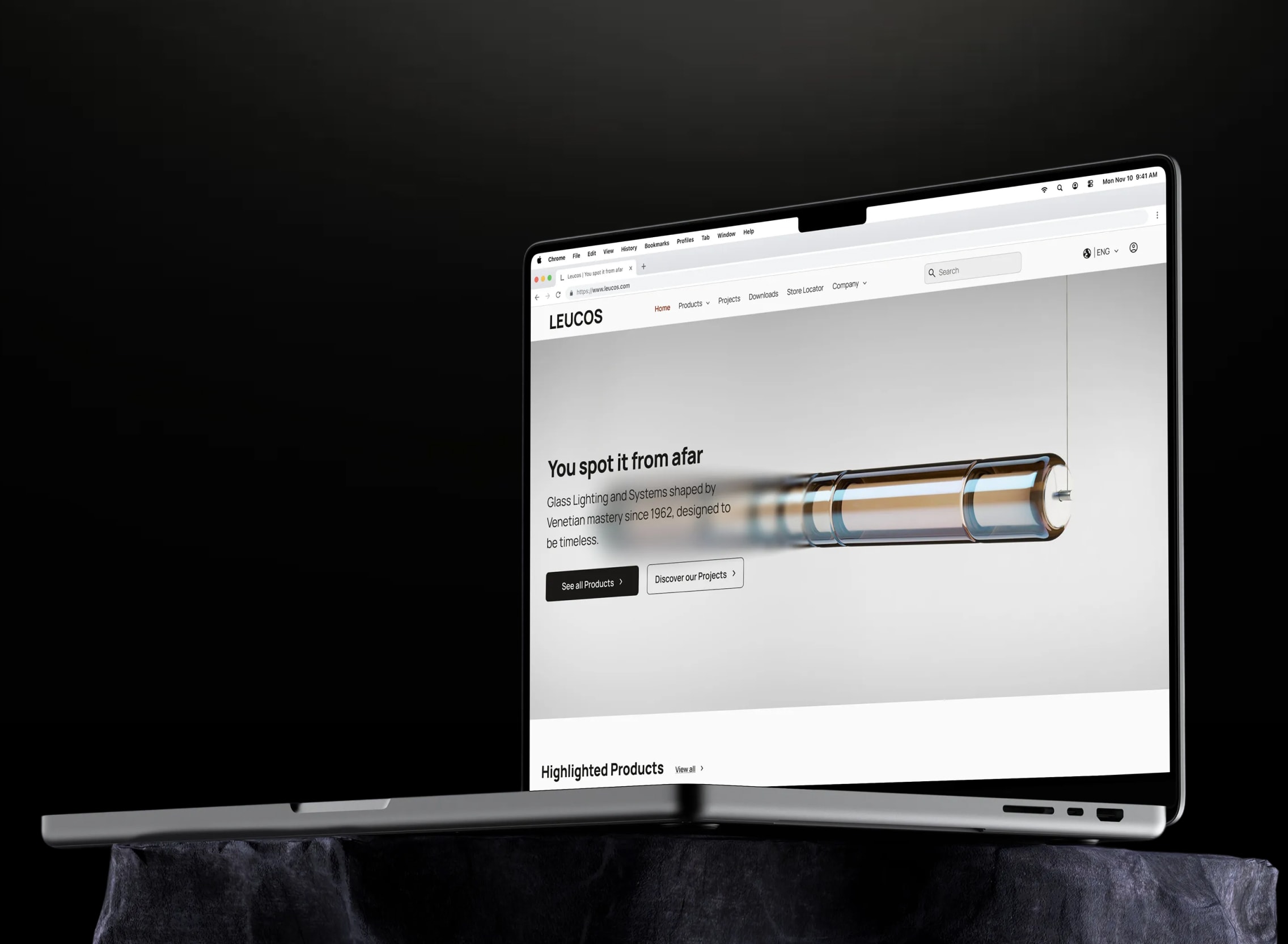
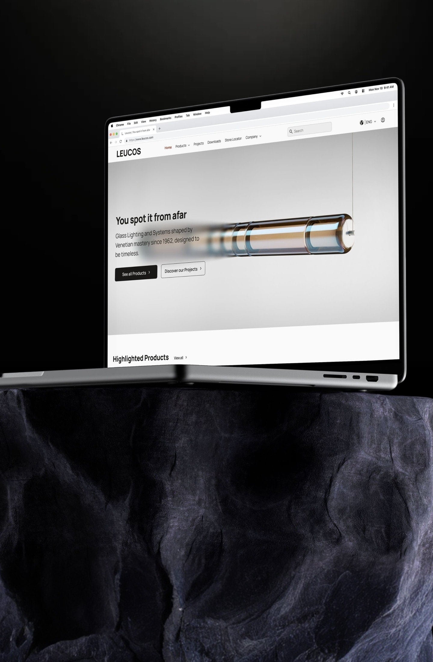
I restructured the information architecture and homepage hierarchy to create clearer paths through the brand’s content. The redesign introduced a descriptive value proposition, visible desktop navigation, prioritised entry points, clearer copy, and consistent interaction signifiers. Reducing the hero to 90vh revealed part of the next section and signalled that more content was available, while manual carousel controls and permanently visible actions made the experience more stable and accessible. I refined the design across four iterations and validated the final direction through two usability sessions, where users found the navigation clearer.
The Results
2/2
Usability sessions validated clearer navigation


The Process
A premium brand still needs a clear way in

Finding where the experience broke down

Shaping a clearer experience around the brand

A premium brand experience should feel distinctive, not difficult to navigate.


Wrapping up
This project reinforced that a visually distinctive homepage still needs to answer a few basic questions quickly: what the brand offers, where users should begin, and how they can move through the experience. It also showed me that a UX audit becomes more valuable when its findings are translated into clear design priorities rather than treated as isolated interface issues. Balancing Leucos’ premium identity with stronger hierarchy, accessibility, and user control became the central challenge, while usability testing confirmed that the revised navigation was clearer.